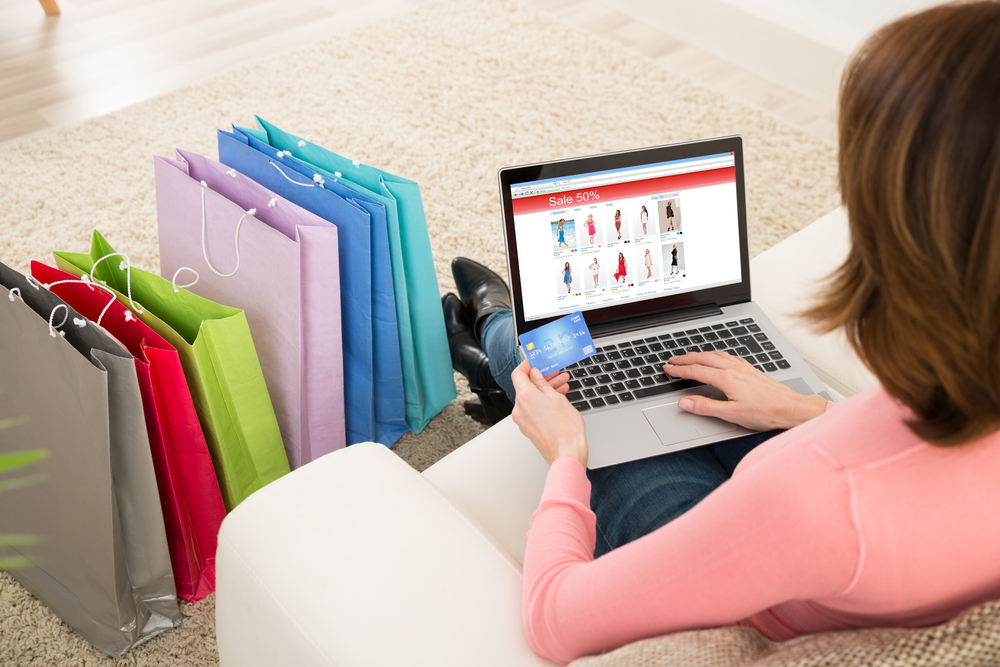
The psychology of eCommerce Checkouts: how to get your customers to reach the Thank You page
Posted on

It’s a long journey that your customer takes from discovery to purchase while moving through your sales funnel. During this process there is many a slip between the cup and the lip. Sometimes high potential customers fall through the cracks and leave eCommerce companies wondering where they’ve gone wrong.
You can either make an educated guess on understanding your customers psychology. Or you could analyze patterns in behavioural data to understand and view things from your user’s perspective. In either case, we’ve seen companies keep a close eye on every step of the funnel, scrutinizing their customer’s every move. Here are some tips on the psychology of online checkout that’ll help your customer reach the ‘Thank you’ page successfully.
Discovery
In the online world, being found is equivalent of ‘existing’. If your customers can’t find you, then you don’t exist for them. The sales life cycle starts at this early stage where you take a series of steps to optimize your entire website and especially product pages to ensure customers can find you online.
Category Page design
The category page is an important step for your customer who is deep in the decision-making process on whether or not to make a purchase from you. This is the page that presents them with an array of choices and should be easy to navigate and understand at a glance. It is a page that will either push them to choose a product and keep moving in the direction you want them to… or it will make them bounce right off. The category page must display the most essential information about the product which is the way it looks (image), the name and the price along with discounts if any.
Along with this, there should be easy filters for price, colours, brands and features on the left that allows users to sort and select.
The Product Page
Here’s where the devil lies because here’s where the details truly matter. Most customers will make a purchase decision within 90s of seeing a product. That is a whole one and a half minutes that you have to impress and floor them. In internet time that quite a lot, so you need to make it count.
a) Offer different product views:
People would love to get a ‘feel’ of the product as much as possible before they buy. Is that scarf red or deep orange? What would it feel like to carry that leather purse? Most people try to find answers to these questions by zooming in and trying to get as close to the product as possible from different angles. Some eCommerce websites have seen a 58% increase in sales by simply adding different views of the product.
b) Add as much details as possible in the description:
The very fact that someone has clicked into a product is that they want to know more. Here’s where flowery creative language can be used to convince that there is truly no product like the one they are holding. From colours to sizes, manufacturer details to delivery time, history to usage, provide detailed description on how the product works and how it is a must have.
c) Add a video:
Video is one of the most powerful tools to include in your product detail page. It can be a how-to video, an ad or just a fun video around the product. Any of these are likely to increase engagement from the user. Surveys show that 50% consumers are more confident about their purchase decision after watching a video and they are more likely to return to the website too.
Checkout page design
Checkout pages are notorious for having the highest drop out rates in the sales funnel. These are pages where customers tend to discover hidden charges, feel bored to give out detailed information or may even suddenly face trust issues if they feel the process isn’t as secure as they want. Here’s what you can do
a) No hidden charges
Ensure that your product detail page has all the price info including taxes, shipping and any additional charges (like gift wrapping, express delivery) etc. This will leave no unpleasant surprises during checkout
b) Clearly mention delivery locations
If your product has delivery location restrictions, allow customers to check this in the product detail page before they proceed to checkout.
c) Keep the process simple
Checkout isn’t the place for you to collect your customer’s biodata. Keep the info simple, leading and quick so that people can move through the process quickly.
d) Offer fully secure payment options: Check out the best payment options that your customers want. If many prefer Cash on Delivery (CoD) over cards, you’ll probably have to go the extra mile to ensure they get to pay you the way they want.
e) A great thank you page
Once your customer has brought a product, make the Thank you page engaging with the right information on the product, billing, expected date of delivery and what else they can buy from your site.
Post purchase communication
As a part of procedure, ensure that you send a Thank you email with the purchase details, a communication number if they have any questions.
This purchase is just the beginning. Be prepared to start the serenading process all over again.
