How Does A Payment Page Influence Purchasing Decisions?
Posted on

Introduction
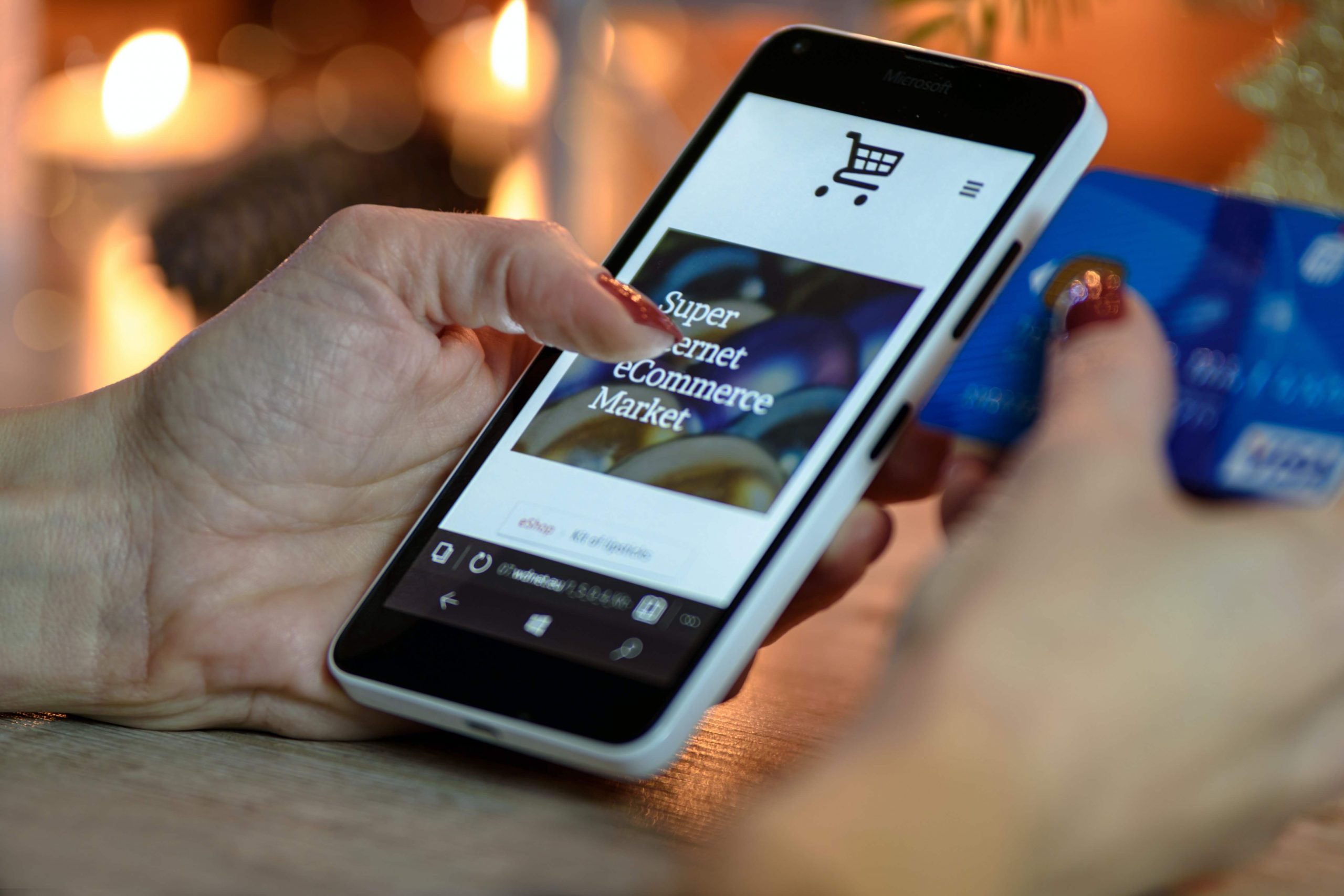
With the development and advancement in e-commerce, the online payment methods have seen a massive increase across the globe. Now, a customer has multiple options to complete an online transaction and a number of factors to consider the favoured option. The payment page design of a website is one of the key determinants while making a choice. A user-friendly payment page saves a lot of time and enables smooth transactions. Have you all experienced a complex payment page which takes a lot of time and is difficult to operate? This could actually lead to incomplete transactions and ultimately lead to a loss of customer-base.
Since the payment page is the last step of a purchase, it is essential to have an effective and simple checkout process. So, what goes into building a frictionless payment page? In this article, we will reveal some of the best payment page design examples that will encourage customers to make frequent purchases. Read on.
What Goes In A Good Payment Page?
If you want to know about the best checkout page, you need to explore multiple payment page design options. The checkout page design you choose depends on your preferences. You can also take the help of expert web designers for the best results.
Browsing through templates will also help you to come up with a personalized payment page. A smooth UI makes it easier for customers to navigate the website. Let us look at the different payment page designs:
Payment Page Design Examples
-
Figma
Figma is one of the best examples of a user-friendly design. The payment information is minimal. As a seller, the only field you need to access is entering details of the credit or debit card..
All other information is extraneous. With customization, you can keep the payment form as simple as possible. Figma known for its simple and sleek payment gateway design makes it easier for customers to make purchases.
-
Dribble
The biggest benefit of this design is that it highlights simplicity with an eye-catchy interface.
Dribble’s checkout design has an intuitive user interface that keeps the information field minimum for the customers. This makes it more likely for customers to complete the process and make a purchase.
It is critical for your business to keep the checkout page as simple as possible to motivate the customers to complete the payment process. The payment page provides an organized and clean format with inviting colors.
-
Nike
The feature of the product image appearing at the checkout makes it easier for customers to review what they are buying before completing the transaction.
Nike uses the three-step process and creates a display where all steps are on a single page. This eliminates the use of multiple pages to complete a transaction.
-
Minimalist Page Idea
The minimalist design is the same as the Nike design, which displays the item on the checkout page and attracts the customers further about the purchase. The design utilizes the space between the images and texts beautifully.
With everything on one page, customers find it convenient to make a purchase.
-
Apple
The checkout page of Apple has a simple white background. All you can see are the blue call-to-action buttons. It makes it easier for the customers to know what action Apple wants them to take. Customers do not need to sign up before buying any product. They can shop as guests, reducing the cart abandonment problem.
Also Read: How to Integrate Payment System Into the Existing App
-
Nixon
Customers generally go through several steps before completing the checkout process. Sometimes, it is longer than expected. Hence, Nixon uses the progress bar at the top of the page to show customers the development of the purchasing process.
-
eBags
The elegant and simple layout makes the payment page design sleek and stylish. Customers can customize their cart when buying the products. The website clearly says which information is mandatory for customers to fill. To make it even better, eBags have a live chat option, allowing customers to ask questions and get answers immediately during the shopping experience. Many customers can get points with each upcoming purchase.
How to Optimize The Payment Page?
For a great payment gateway page design, the idea should be to eventually increase sales and reduce the number of unsuccessful transactions. You can optimize the payment page in the following ways:
-
Usability
The primary goal of the usability analysis is in the number of steps and actions from the moment you click the pay button until the payment completes. It is essential to reduce the number of steps, structure them logically, and arrange the essential elements in a sequence convenient for human perception. The buyer must understand the type of button that should be pressed at a given time to move towards the purchase completion.
-
Financial Security
The payment page should be individually generated for each transaction. User data should be reliably protected from intruders. Whenever the billing details and personal information of the customer are involved in the checkout process, it is necessary to consider the precautions to keep the information secure.
Also Read: How to Increase Alternative Checkout Options
Conclusion
To conclude, if you are facing issues with making purchases online and are confused about what to do, an easy-to-use and simple payment page design can be a safe solution.
